The Challenge
The Process

Con Edison
Type of Work & Role
Agency - UX Apprentice
The Challenge
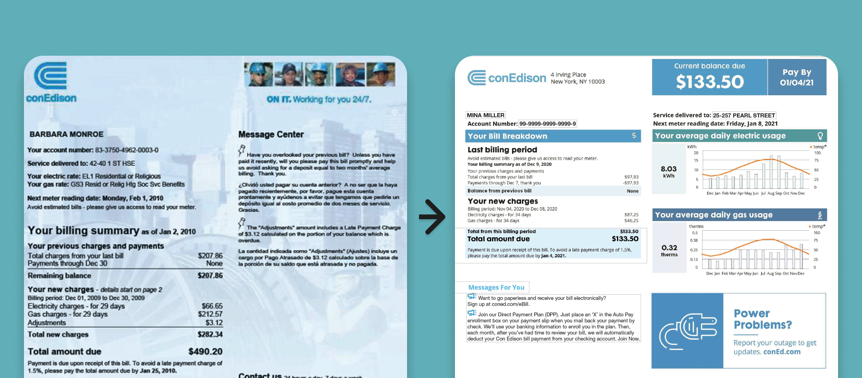
ConEdison had redesigned their website and wanted the paper bill experience to match. They also needed the bill to be more scannable, encourage users to go paperless, and use less paper to print.
What I Did & Why
I created over 30 physical prototypes of the redesigned paper bill to replicate the experience of when a user receives and opens the bill in the mail. This brings up several questions and considerations.
- How might we condense the presentation of the maximum information necessary on a bill from 4-5 pages to 2-3?
- Since the bill will be folded to fit into the envelope, how to avoid creases affecting information?
- What information can be seen through the envelope's plastic window?
What We Learned & Results
There are 3 major pieces of information that users need to know when receiving their bill:
- Is this my bill?
- How much do I owe?
- When is it due?
For this reason, this information can be clearly seen as soon as the bill is pulled from the envelope with more details being revealed when it's unfolded. The redesigned paper bill was successfully launched to conEdison's millions of customers.

Bitter Blush App
Type of Work & Role
Startup - UX Designer
The Challenge
Bitter Blush is a blog and brand with a strong Instagram community that highlights topics that typically make us blush (like mental health, identity, and dating). The founder of the brand tasked me with designing an app that would teach about these topics.
What I Did & Why
I conducted 5 user interviews with potential users who have all engaged with the Bitter Blush brand to learn more about user goals and needs. I also did a comparative analysis with similar apps and experiences to get an idea of what functionality would be necessary and familiar. Some experiences included:
- Bloom (Therapy App)
- Noom (Weight Loss Psychology App)
- Learners (UX Research Education App & Site)
What We Learned & Results
Users love to learn, they value the feelings of growth and progression. Users were also into books, podcasts, and YouTube videos for learning, but not as much TikTok. There were varied preferences in learning, including listening, watching, and conversation.
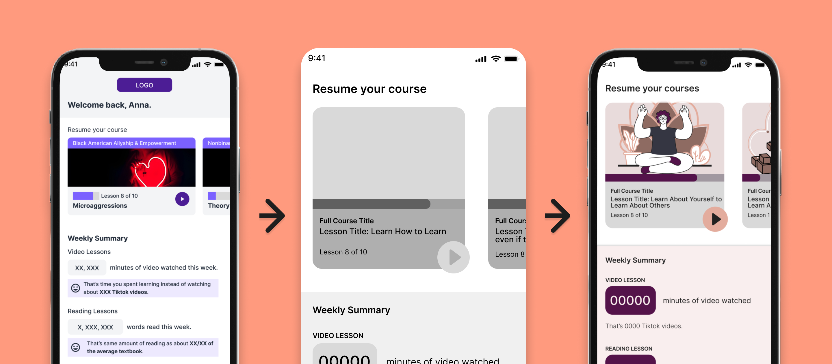
- Since users value feelings of growth, I included an upfront progression bar to encourage learners to engage and complete lesson content
- Because users have varied preferences in engaging with content (Note: auditory, visual, tactile etc. learning styles are a myth! We all learn through a combination of these methods), I designed the option for learners to select video or written content. This also improves accessibility.
- To influence learners to spend less time zombie scrolling and more time learning, I included info comparing how much time has been spent learning to other media such as TikTok and social media, books, or articles.
I designed the first version of the app using NativeBase components then iterated on that to build a version true to the brand in style and color. I created a short clickthrough prototype of version 1. Check it out here.
The Result

ThriveDX UX Curriculum
Type of Work & Role
In-house - UX Curriculum Designer
The Challenge
The ThriveDX UI/UX program grew beginners from not knowing much about UX to designers conducting research, creating wireframes, and building prototypes with a 5-project strong portfolio through 15 courses in just 10 months.
What I Did & Why
I researched and designed lessons within the program including lessons on Microinteractions, Prototyping, and Preparing for Research, and many, many more. Lessons would include a deck for instructors to present to learners, a course book for students to reference at their own pace, and a module guide to assist instructors with teaching. Here's some actions I took to gather better insight about the class experience:
- I taught an Intro to UX course through our New Jersey Institute of Technology (NJIT)program to a class of 20+ students which included 9 modules (lessons) over the course of a month
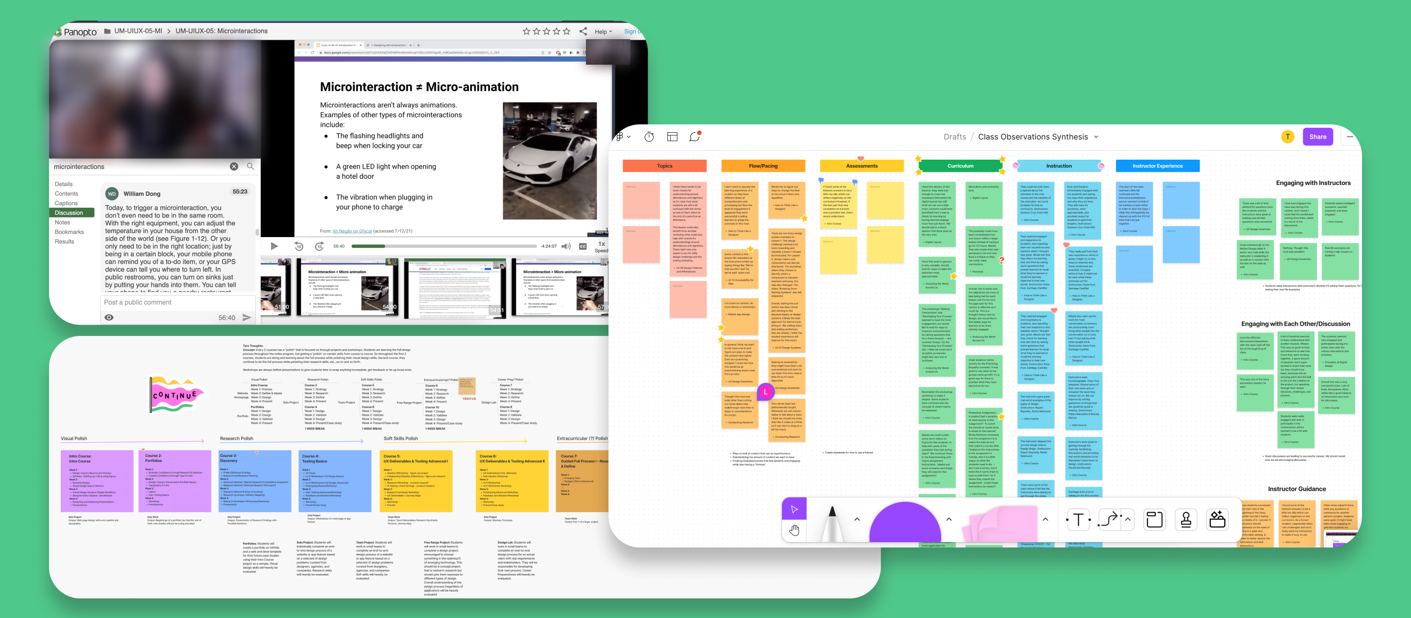
- I observed 12+ 3 hour classes, noting down instances relevant to success or disruption in the learner experience
- I affinity mapped 90+ observation notes into 10 themes, then reviewed and collaborated on with 2 other designers
What We Learned & Results
An insight developed from this was that learners feel bored and disengage from curriculum content if it's bloated with redundancies. To address this, I scoured courses for contradictory or unintentionally duplicative content, logging mentions of certain ideas, themes, or words into a glossary-like index for the team to track and manage this kind of content. Note: For education, it's important to repeat the same idea in different ways and to call back information from earlier classes/courses. Redundant information was considered any pieces of curriculum that felt contradictory, irrelevant, or like it was being dragged out.
Before sunsetting in 2022, the UX Design Program boasted NPS scores of 8+ and was offered through universities such as NJIT, California State University Long Beach, and University of Wisconsin-Madison.


